Flagsmith
Turning an Internal Tool into a Global Open-Source Product
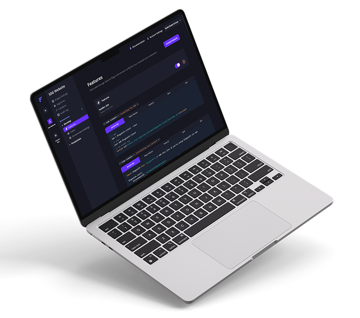
Web Application
Redesigned Flagsmith's core navigation and UI, simplifying feature management, improving usability, and supporting the platform's evolution from an internal tool to a leading open-source product.
- Role
- Product Designer & UI Developer️
- Year
- 2020
- Disciplines
- UX Design, UI Design, Interaction Design, Frontend Development
About Flagsmith
I led the redesign of the web app's navigation and contributed to refactoring the UI codebase. The goal was to simplify workflows, improve scalability, and support the company's transition from internal tool to successful open-source product.
The Problem
Key issues identified:
- Complexity and Clutter: The menu structure struggled to accommodate new features and overwhelmed users.
- Inconsistency: Navigation patterns and visual hierarchy lacked consistency across sections.
- Findability Challenges: Users couldn't easily locate projects or environments and terminology created additional friction.
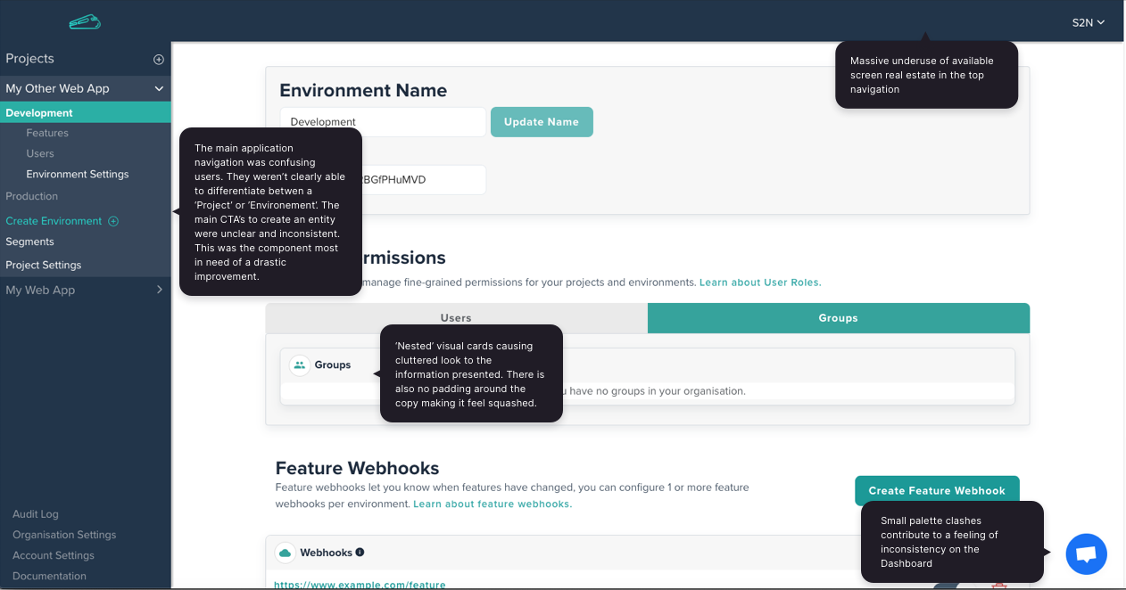
It’s not immediately clear what’s a project vs. an environment. I spend more time finding things than configuring them.
User feedback / GitHub discussion thread
01 / Discovery & Research
Research & Insights
Methods included:
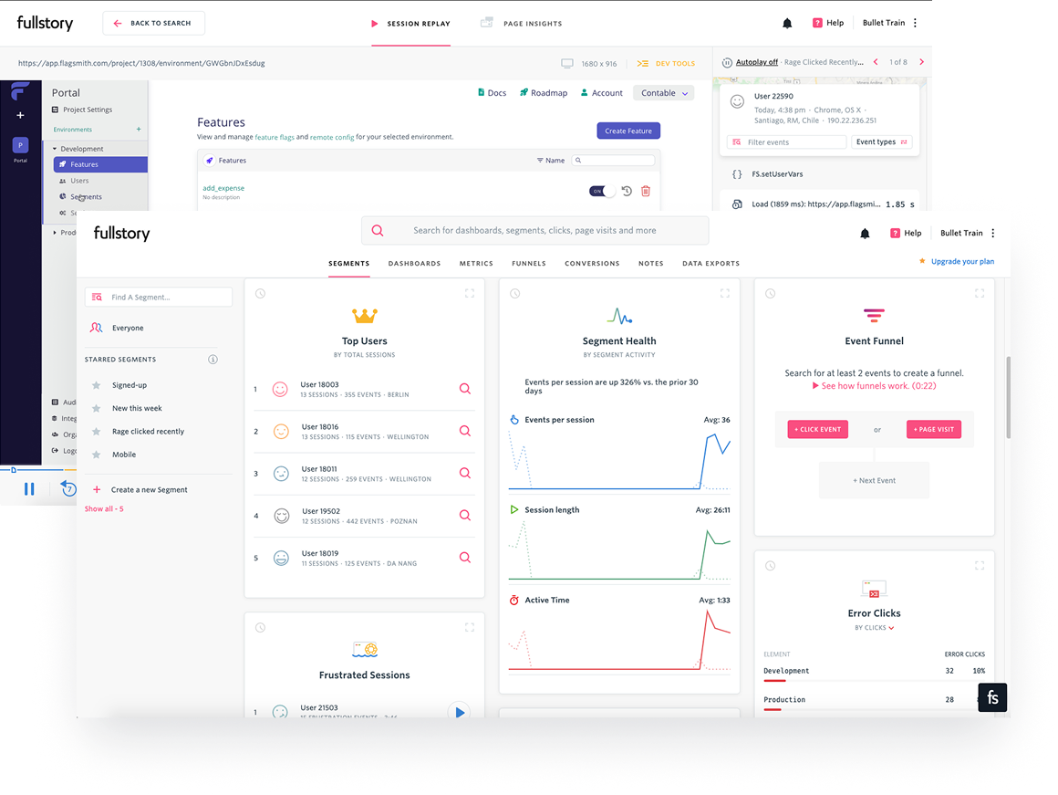
- User interviews and surveys with active open-source contributors and paying customers.
- Behavioral analytics via FullStory to identify rage clicks, misclicks, and friction points.
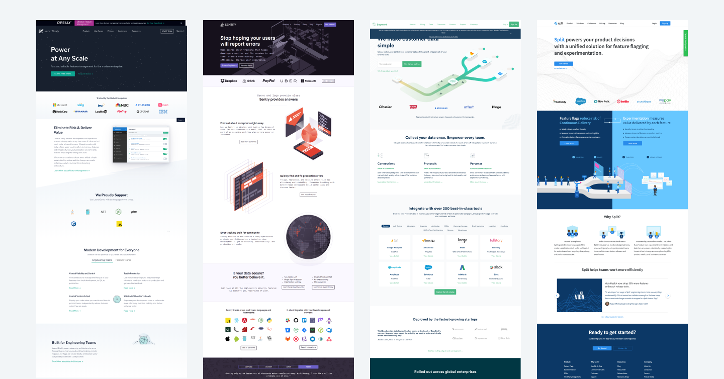
- Competitor benchmarking of other configuration platforms such as LaunchDarkly and ConfigCat.
Users wanted more clarity, fewer clicks and a clearer hierarchy that would result in less cognitive load.
Design Goals
- Improve findability of core features and navigation clarity.
- Enable scalability for future feature growth.
- Modernise the UI with consistent typography, color, and iconography.
- Increase front-end efficiency through code modularisation.
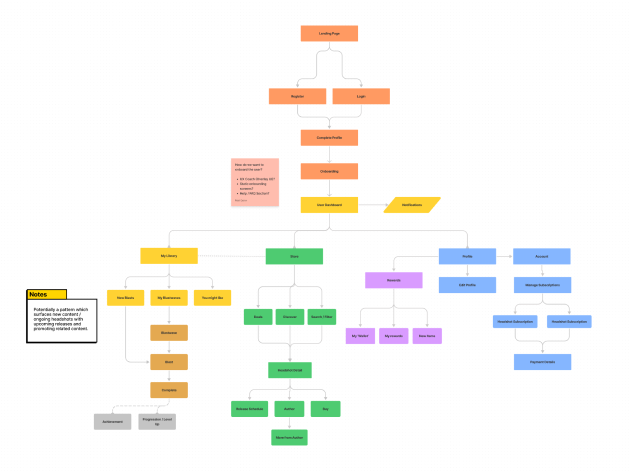
IA & Wireframes
Wireframes explored various sidebar patterns and content hierarchy approaches, validated through quick internal usability tests.
02 / Design Exploration
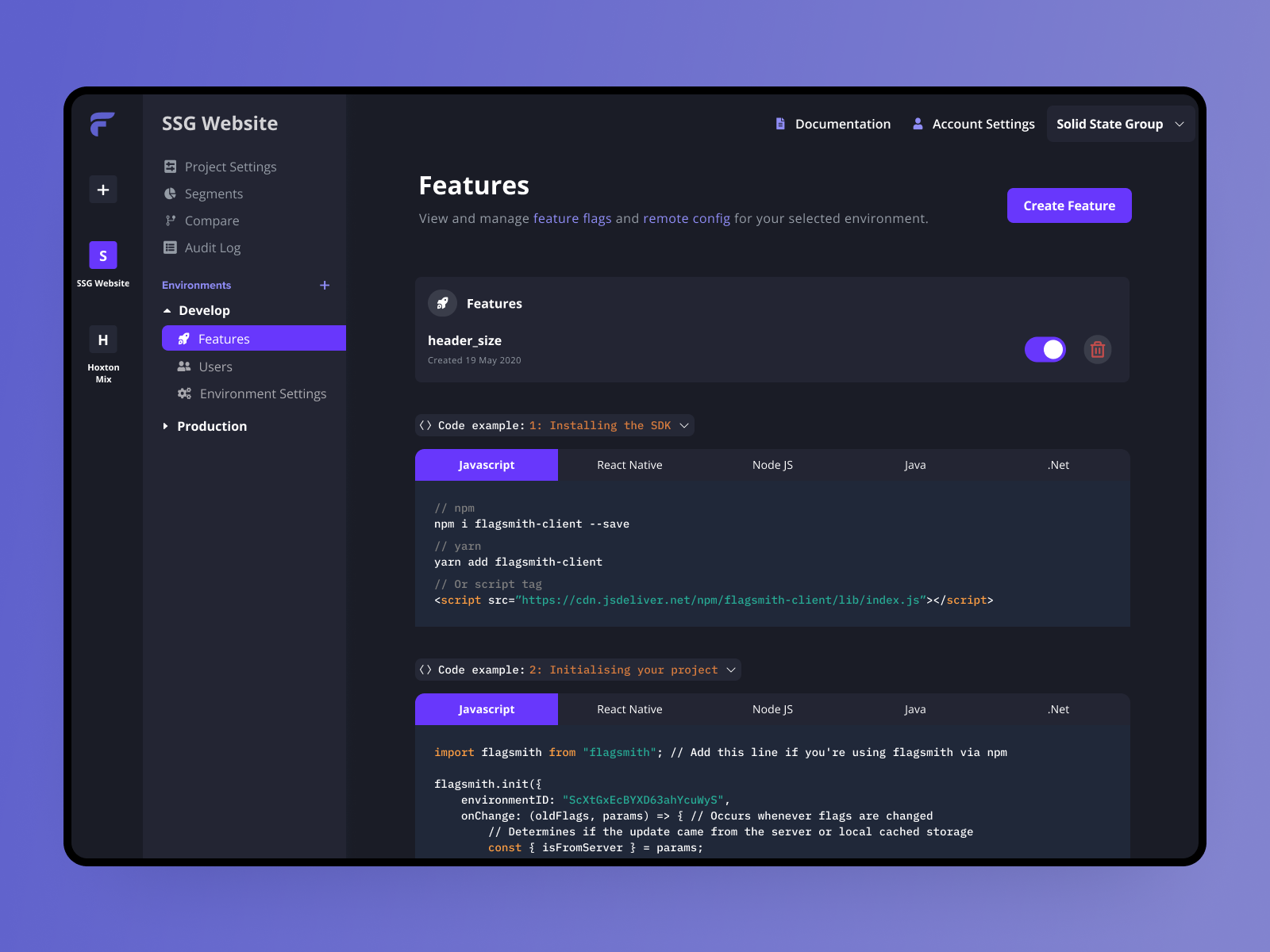
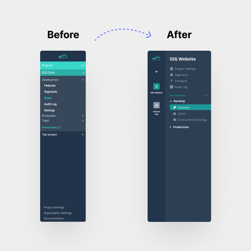
Navigation Redesign
- Introduced a persistent left sidebar for key navigation items.
- Added collapsible menus to reduce clutter and allow scalable sub-navigation.
- Integrated a global "Create" button for quick access to key actions such as adding flags or environments.
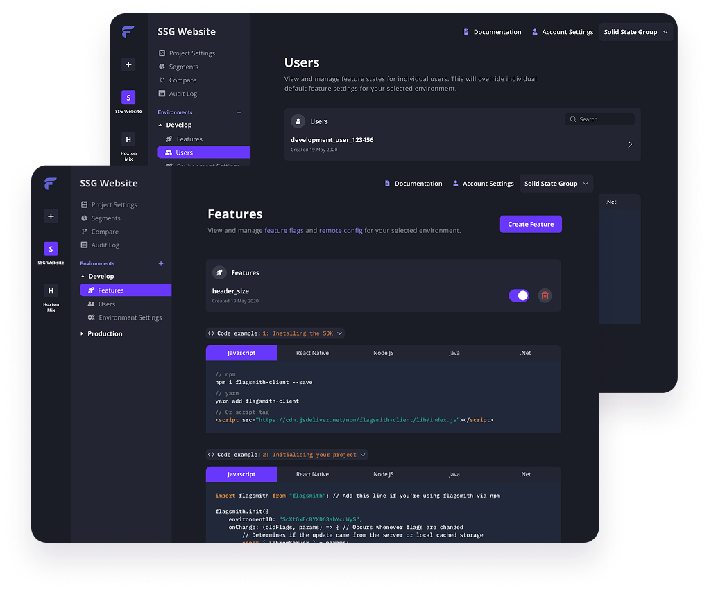
Visual & Interaction Design
- Established a refined UI system for typography, color tokens, and spacing variables.
- Rebranded the old Bullet Train interface with the new Flagsmith visual identity. Introduced a more modern UI with improved hierarchy, contrast, and focus on clarity.
- Improved contrast and legibility to meet accessibility standards while aligning with the new brand's visual tone.
03 / UI Implementation
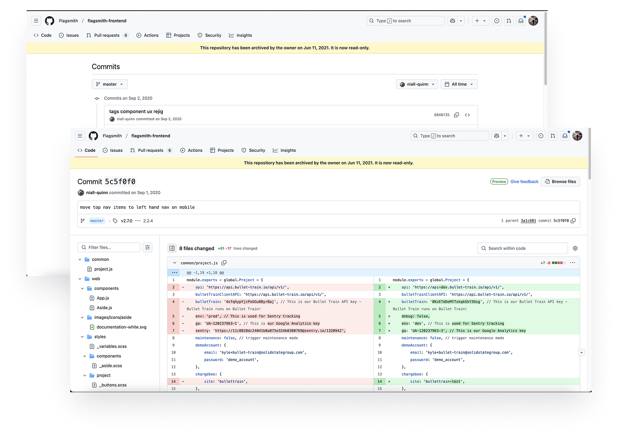
UI Development & Code Refactoring
Testing & Validation
The redesign makes navigating Flagsmith so much faster! Everything feels exactly where it should be.
User feedback / GitHub discussion thread
Impact
30%
Faster task completion time as users more easily located and managed feature flags within the new navigation structure.
20%
Increase in feature adoption from improved visibility of environments and clearer project differentiation.
5.3k
Github stars, solidifying Flagsmith as one of the most popular open-source feature flagging tools in the world.
LOVE the new design. Great job. HIGH FIVES TEAM.
Ben Rometsch / Co-founder, Chairman of the Board @Flagsmith
Niall Quinn 2026