Bauer Media
Enhancing the Radio Listening Experience for the Rayo App
iOS, Android
Redesigned the Rayo app to significantly improve content discovery and user navigation, resulting in notably increased engagement and positive early user feedback indicating substantial improvements in average time spent listening (ATSL) and on-demand content engagement.
- Role
- Senior Product Designer️
- Year
- 2025
- Disciplines
- User Research, Research synthesis, UX Design, UI Design, Design Systems
The Problem
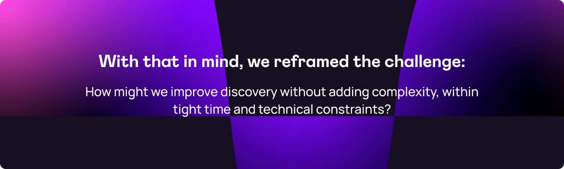
The initial product proposal was to add a new dedicated station page to house schedules and catch-up content. This raised a key question: where should this new page sit within the existing information architecture?
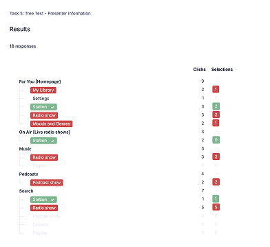
Tree-test evidence: adding a new station page increased navigation errors instead of improving discovery.
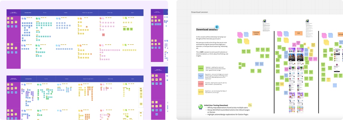
Research & Insight
The results were clear:
- Adding another top-level page increased navigation errors.
- Users already felt overwhelmed by the number of destinations.
💡 Insight: Adding a new page would solve one problem but create another.
Processes:
- Tree Testing
- Auditing existing app feedback
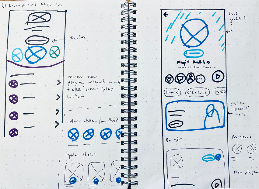
Initial concept for a dedicated “station page” within the app, with station led branding. We wanted to validate whether or not this page was actually useful to users
Design Approach
We tested high-fidelity prototypes with 14 participants (7 Bauer listeners, 7 external) across iOS and Android.
Findings confirmed that users valued:
- Immediate access to live radio
- Consistent UI patterns
- Simpler navigation paths
Processes:
- Sketching
- Moderated Usability Tests
- High fidelity design
- Research synthesis
Clickable prototype
Figma prototypes to test different concepts for the journey to and content for Schedule and Station pages.
Research synthesis
Solution
- Master Schedule: A new schedule page with clear, persistent entry points across the app.
- For You page: Redesigned to surface live radio and access to schedules more prominently.
- On-Air & Maxi Player: Standardised components and integrated popular station elements to reduce cognitive load.
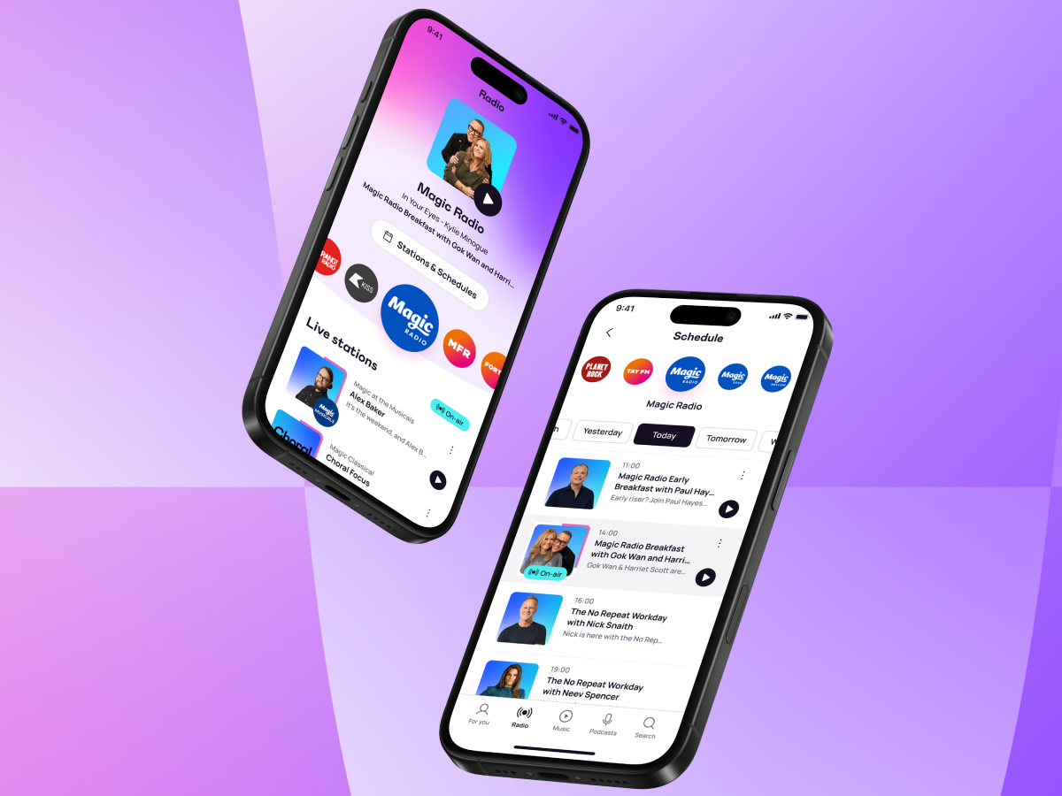
Updated For You, On-air and Schedule pages
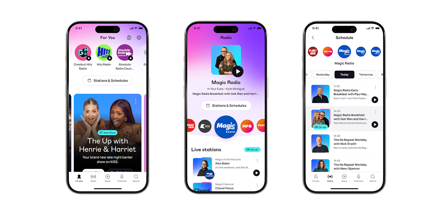
Enhanced Maxi Player
We also recommended the strategic integration of popular station page elements (e.g., featured shows, presenters) into existing, high-traffic areas of the app, such as an improved Maxi Player.
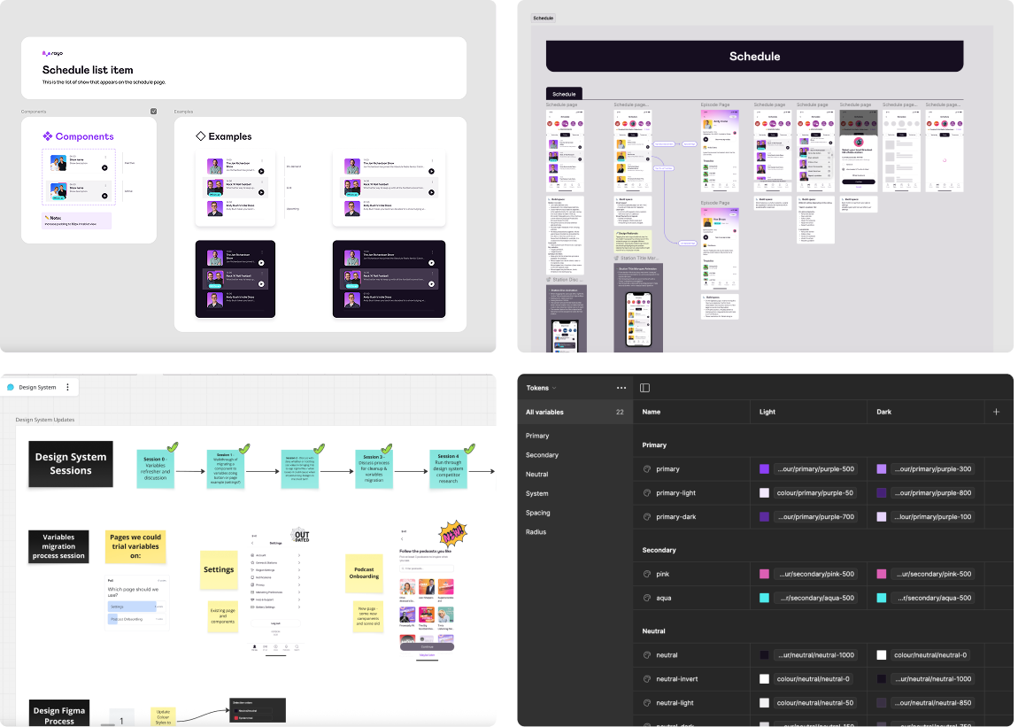
Design System Impact
- Introducing design tokens and variables for colour and spacing
- Establishing clearer component naming conventions
- Running weekly design system workshops to facilitate knowledge sharing and consistency across teams
- Leading refinement sessions with developers to help estimate and deliver the work
Results
+10%
increase in average time spent listening.
+15%
increase in on-demand listening.
4.8 ★
Average for the new App store rating, up from the 3.0 legacy average.
Reflection
Niall Quinn 2026